

How to Read a Suburb Profile to Avoid Buying in the Wrong Area
Reading a suburb profile well means weighing a handful of metrics against each other, not scanning the median price alone. Vacancy rate, days on market, and ten year capital growth carry the most weight in a genuine suburb profile, while median price on its own tells you the least.
Most buyers do the opposite: they check the median, recognise the suburb name, and move on. This produces confident decisions built on incomplete information. A suburb profile only becomes useful once you know which metrics predict performance and which are mostly noise, and applying that discipline consistently is what separates a sound property investment from a costly one.
What a Suburb Profile Actually Contains
A standard suburb profile includes median house and unit prices, capital growth across 1, 5, and 10- year periods, gross rental yield, vacancy rate, days on market, owner-occupier vs investor ratio, population growth trends, and auction clearance rates.
The mistake is treating any single metric as the full picture. A 6% rental yield looks strong until you check vacancy sitting at 4.2% and rising. A rising median looks like momentum until you see days on market have climbed for four consecutive quarters.
None of this analysis means much without knowing your own numbers first. Your borrowing capacity sets the realistic price band before a single suburb metric gets weighed against another.
Which Metrics Actually Move the Needle
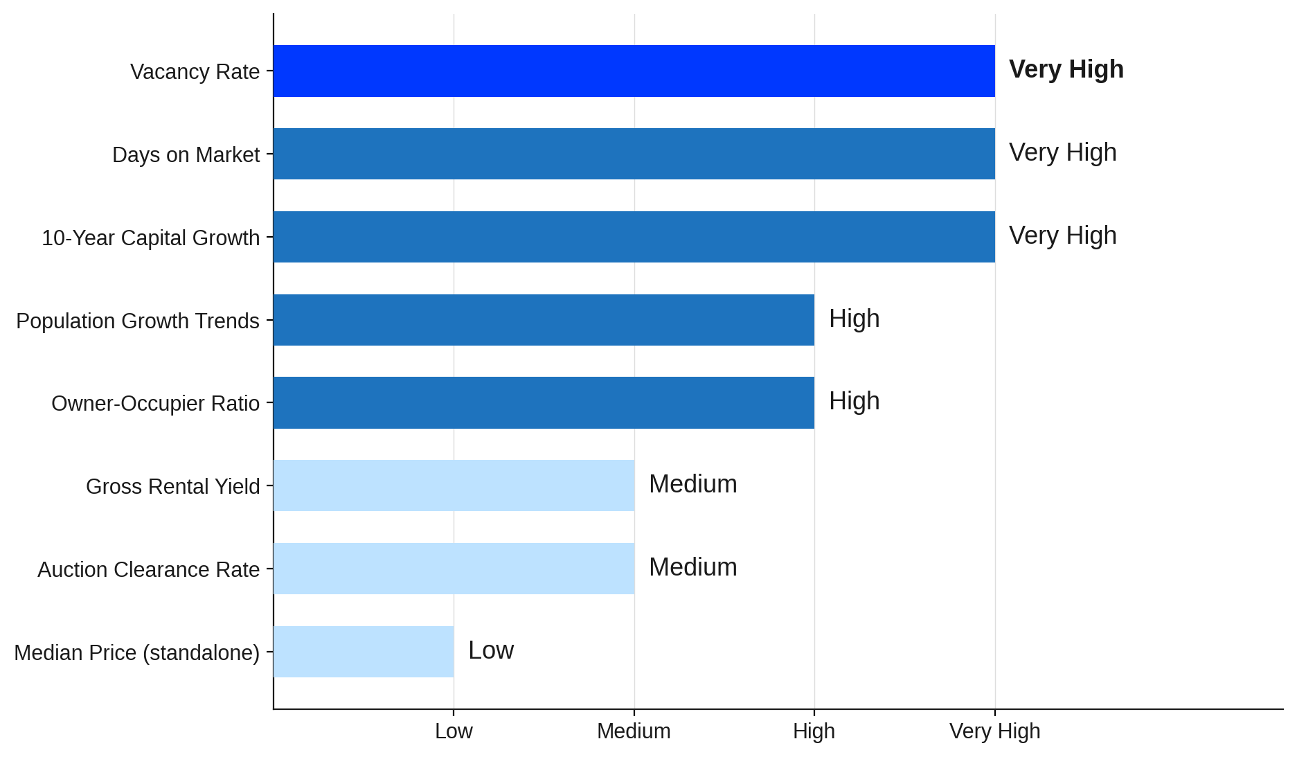
Source: CoreLogic, SQM Research, ABS, 2026.
Breaking Down Every Metric That Matters
Each metric in a suburb profile answers a different question. Here is what each one is actually telling you.
Median House and Unit Price
Median price shows what buyers are currently paying. It is a reference point, not a signal of where prices are heading.
The more useful question is what the median has done over time. A suburb where prices rose 20% in one year but were flat for the five years before that tells a very different story than one with consistent 6% growth across a decade.
House and unit medians also diverge in ways that matter. Units often yield higher on paper but grow more slowly, while houses tend to hold land value better over time.
Capital Growth History
Capital growth tracked over 5 to 10 years reveals whether a suburb has structural demand or just had a short term spike. Single year price movements happen almost everywhere.
A decade of steady appreciation requires something the suburb is genuinely doing right. Look for consistency across rate cycles, not just a strong recent run.
Gross Rental Yield
Gross yield is annual rental income divided by the purchase price, expressed as a percentage. It tells you how much rent the property generates before expenses.
It does not tell you about vacancy, property condition, or tenant turnover. Two suburbs showing 5.2% yield can represent completely different risk profiles.
High yield in a location with rising vacancy is a trap, not an opportunity. The rental crisis has pushed up gross yields in some regional markets where the fundamentals do not support long term performance.
Vacancy Rate
Vacancy rate decides who holds negotiating power in the rental market. Below 2%, landlords do. Sustained above 3%, tenants do, and that shift flows through to rental income faster than it appears in median prices.
Watch the direction, not just the number. A vacancy rate climbing from 1.4% to 2.3% over six months is more informative than a static reading in either direction.
Days on Market
Days on market operate as a real-time leading indicator. When properties start selling faster than they were six months earlier, demand is shifting before prices fully catch up.
Investors who read a falling days on market figure early often enter before the repricing completes.
Owner-Occupier vs Investor Ratio
Owner-occupier ratio signals stability. Suburbs with high owner-occupation tend to absorb downturns more evenly, while heavy investor concentration amplifies volatility in both directions.
If more than 50% of a suburb's properties are investor-owned, it behaves more like a commercial asset than a residential one. Coordinated selldowns become possible, and price falls can accelerate faster than the headline data suggests.
Population Growth Trends
Population flow is the demand signal that typically leads to price. Suburbs absorbing net interstate migration or affordability spillover tend to see rental vacancy tighten well before property prices respond. Australia's housing shortage compounds that effect significantly.
Where construction approvals run below population growth, the supply gap becomes self-reinforcing over time. Flat or declining population over five years is one of the clearest early signals that demand will not support medium term price growth.
Auction Clearance Rate
Auction clearance rate measures the percentage of properties sold at auction versus passed in. It is most useful in Sydney and Melbourne, where auctions dominate the residential market.
Above 70% signals strong buyer competition. Below 55% signals hesitation or oversupply at current price levels, and a clearance rate trending downward for three or more consecutive months typically precedes softening median prices by several quarters.
The relationship between yield and capital growth is rarely straightforward. Strong yield and strong capital growth do not usually peak in the same suburb at the same time.
Healthy vs Warning Thresholds Across Key Metrics
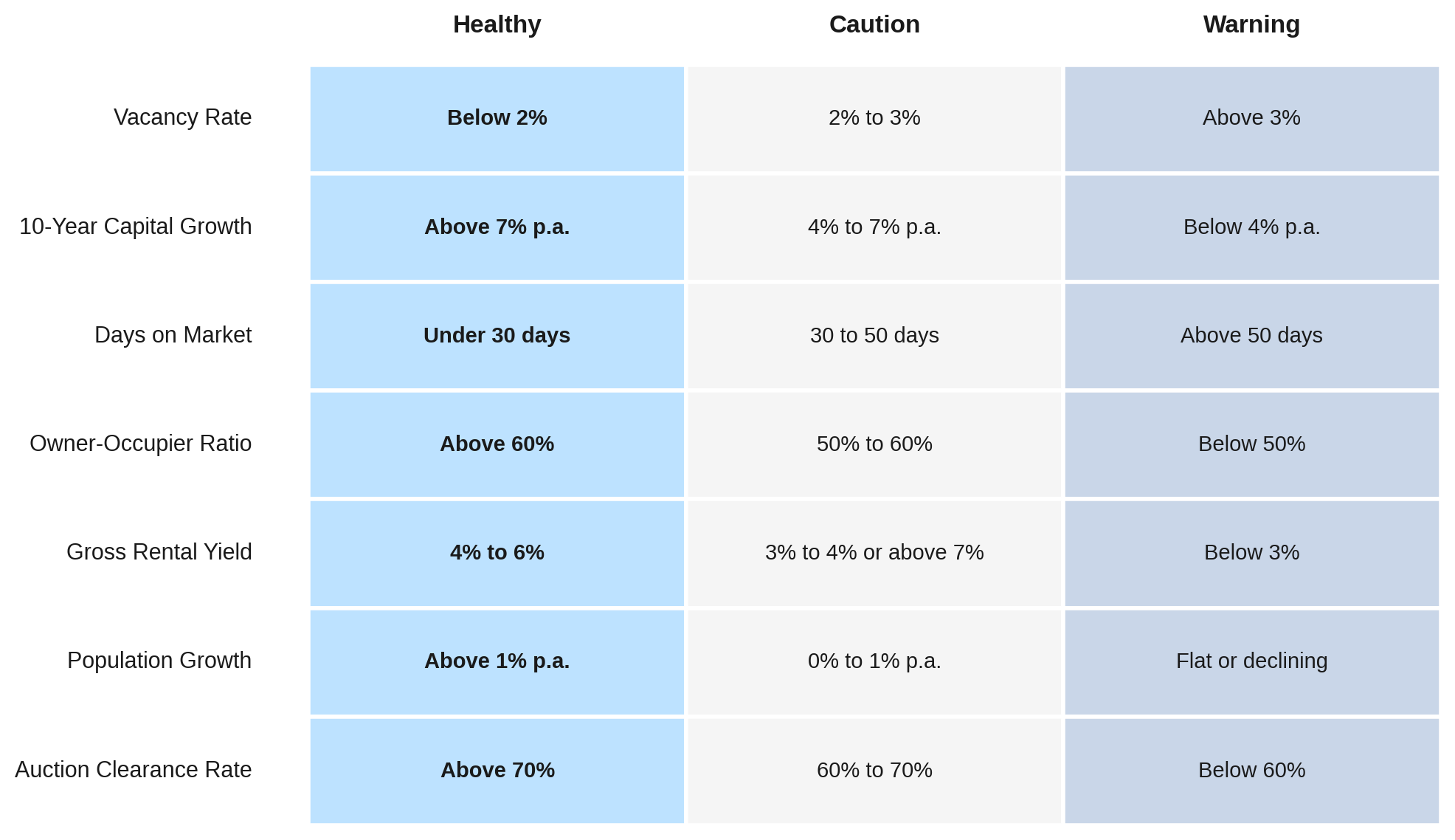
Source: CoreLogic, SQM Research, REIA, 2026.
How to Spot Long Term Growth Potential
Growth suburbs share a pattern that is clearer in retrospect than in real time. Infrastructure investment shifts demand before prices catch up.
A confirmed rail corridor, hospital expansion, or major employer relocation rewrites the commute equation for an entire postcode, often years before the median price acknowledges it.
Population flow is the demand signal that typically leads to price. Australia's housing shortage means that wherever construction approvals run below population growth, the supply gap becomes self-reinforcing.
Warning Signs That a Suburb Is a Poor Investment
Some suburbs look affordable for a reason that will not reverse. The most telling warning patterns appear well before the headline numbers make the case obvious.
Vacancy above 3% for two or more consecutive quarters
High volume of new apartment approvals relative to local population growth
Population that is flat or declining over five years
Median prices unchanged across multiple RBA rate cycles
Yield that only looks strong because prices fell, not because rents rose
The rental crisis has inflated gross yields in some markets that carry serious structural risk. A 7.5% yield in a regional town with declining employment and rising supply is not comparable to 4.5% in a supply-constrained inner-ring suburb.
FOR EXAMPLE
A suburb in regional Western Australia posted a 7% gross yield in 2022 and attracted significant investor attention.
Vacancy was rising across consecutive quarters, a new apartment development was settling within 12 months, and the suburb's largest employer had announced a workforce reduction.
Within 18 months, asking rents had fallen 12% and median prices had dropped 9%. The headline yield had concealed three separate warning signs a thorough profile review would have surfaced.
How to Compare Two Suburb Profiles
Before comparing suburbs, anchor the exercise to your actual financial position. Knowing your borrowing capacity defines the realistic price band, and the price band narrows the comparison pool before any metrics are reviewed.
Use a scorecard across all key metrics: 10 year capital growth average, vacancy rate trend, days on market trend, rental yield, population growth, and clearance rate where available.
Score each suburb against a fixed benchmark, not against the other suburb. A suburb that outperforms a weak comparison but still fails three individual benchmarks is still the wrong suburb.
Rental Yield vs Capital Growth by Suburb Type
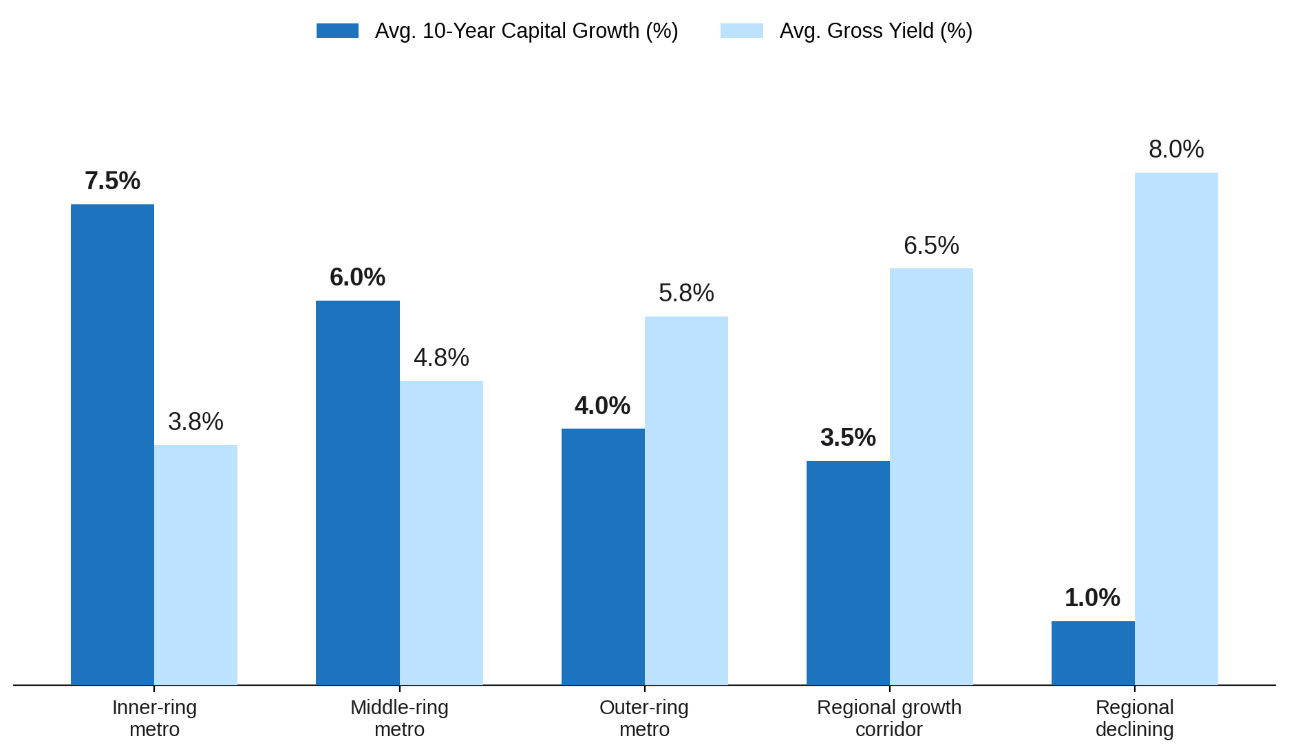
Source: CoreLogic, SQM Research, ABS, 2026.
Common Mistakes When Reading a Suburb Profile
The most common error is making a single metric the decision. Price alone tells you what someone already paid.
Vacancy rate tells you what the current market is doing. Growth history tells you what the suburb has consistently done over time. All three together are the start of a picture, not the end of one.
Relying on one data platform is the second most common mistake. CoreLogic, SQM Research, and the ABS each have different update cycles and methodologies. Where two independent sources agree, the signal is usually sound.
Working with a buyer's agent changes the profile review process in ways that raw data access cannot replicate. Experienced agents read cross-suburb patterns and carry contextual knowledge about infrastructure timing that no published data source captures.
Final Thoughts
A suburb profile is the closest thing the property market offers to an objective test. The test only works if you understand what the right results look like.
Most suburbs that underperform were not obviously wrong at purchase. They passed on price and on a surface yield reading. The warning patterns sat deeper in the data.
The investors who avoid poor locations consistently read profiles against fixed benchmarks rather than surface comparisons, treating each metric as part of a pattern rather than a standalone figure.
Frequently Asked Questions
Recommended Reading
Two pages selected based on what readers of this article are most likely to need next.
Recommended Video
Most investors are still positioned in capital cities — but in 2026, that allocation gap is creating real opportunity cost. In a market where timing, positioning, and yield profiles compound into long-term outcomes, that disconnect matters more than most people realize.